Layered Symbols
Control color, gray value, and emphasis at the layer level without redrawing every asset.
HarmonyOS Symbol Case
Turn icons into a living font system.
Symbol Font turns icons into scalable, weight-aware, layered, and motion-ready resources, giving product teams a unified way to design, ship, and maintain interface symbols.
3500+
vector symbols
Font
resource format
Layered
color and tone control
7
motion-effect types
Overview
HarmonyOS Symbol, designed with Huawei Consumer BG Software UX Design, is a representative case of packaging symbol resources through font technology.
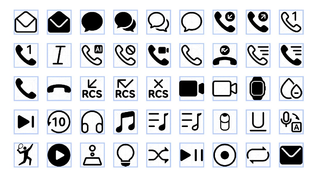
The symbol library includes more than 3,500 high-quality vector icons across system UI, document editing, media, commerce, health, weather, transport, and other product categories.
The icon set integrates with HarmonyOS Sans, aligning to the text baseline and allowing symbol weight to follow type weight so text and icons stay consistent.
Layered structures, system resource calls, and motion effects make symbols adaptable across interface states while keeping production manageable.
Control color, gray value, and emphasis at the layer level without redrawing every asset.
Let symbol stroke weight follow the type system so UI components stay visually balanced.
Connect animated symbol states to taps, long presses, input, loading, transfer, and feedback moments.
System Details
These modules show how HarmonyOS Symbol turns icons into scalable font resources through broad coverage, disciplined drawing rules, type-weight sync, layers, motion, and system calls.
HarmonyOS Symbol packages more than 3,500 high-quality vector symbols. The library spans system UI, document editing, media, commerce, payments, fitness, weather, transportation, and more, giving teams a consistent resource layer for large product ecosystems.
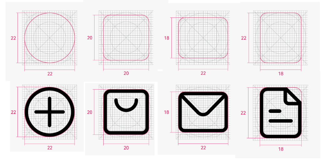
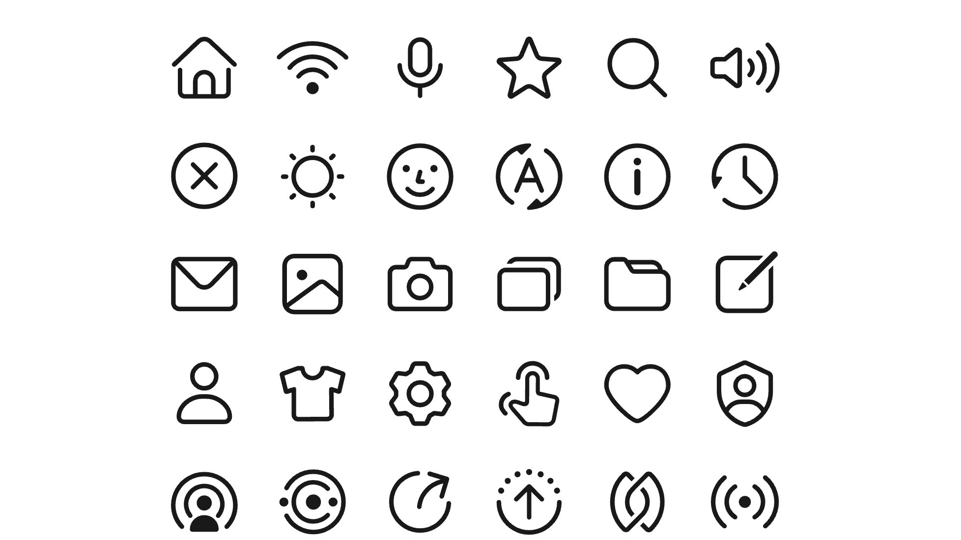
The base icons use simplified geometric construction, controlled proportions, and softened corners. The result is precise but approachable: young, clean, and friendly enough for everyday system use.
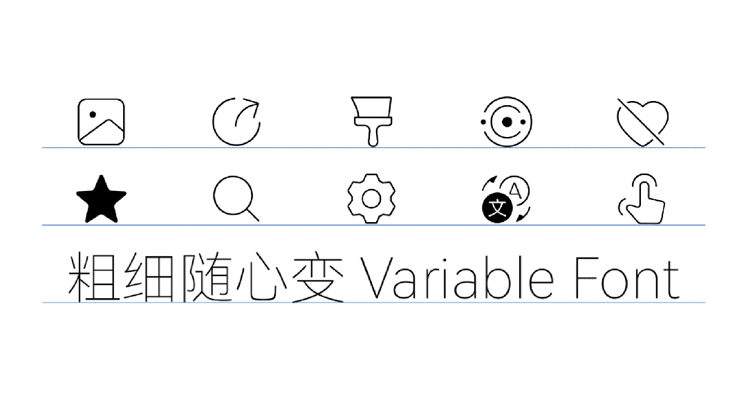
Because the icons are delivered as font resources, they align naturally with text baselines and can follow font weight. Text and symbols stay visually balanced across mixed UI components.
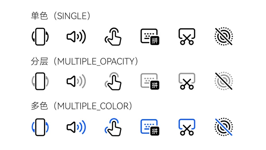
Each symbol can be built with independent layers for color, opacity, and tonal emphasis. Teams can adapt states and themes without redrawing every icon or breaking the system.
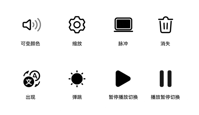
Seven motion-effect families, including appear, disappear, bounce, and custom animations, connect symbols to taps, long presses, input, loading, transfer, and feedback states.
As a system-level icon resource, HarmonyOS Symbol can be referenced through resource names and rendered with the Symbol component. Developers get a simpler workflow while apps stay aligned with the system visual language.
Applications
Symbol Font gives OS, app, and device teams a disciplined infrastructure for icon design and delivery.
Consistency
A symbol font can match type weight, optical size, and interface density across the product.
Production
Designers and developers update a font resource with codepoints, layer logic, and system calls instead of maintaining scattered icon assets.
Expression
Color layers and preset motion effects add expression while keeping the system governable.